What fascinates me about a machine is the experience of a physical and intellectual extension of myself.
-Manfred Mohr
Computer Graphics
|
Visit the LINK.
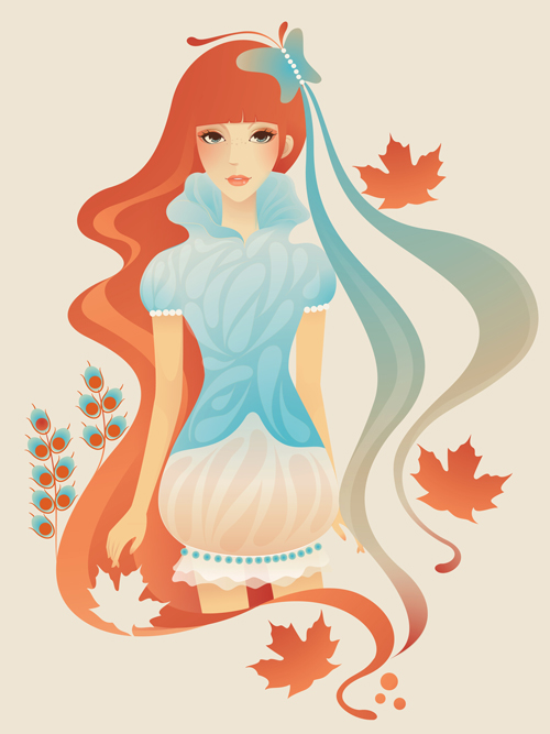
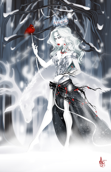
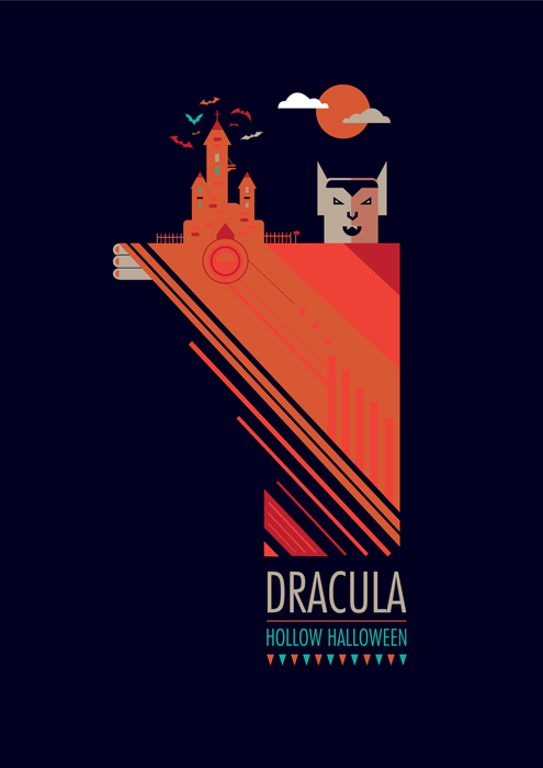
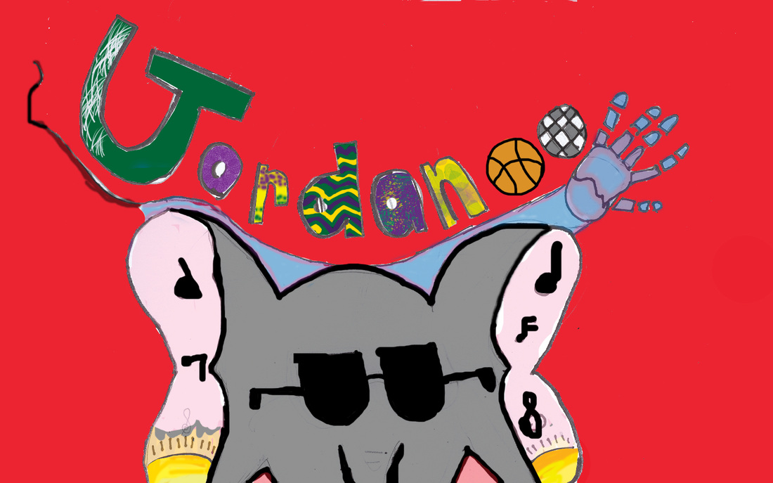
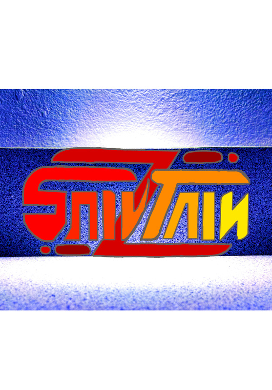
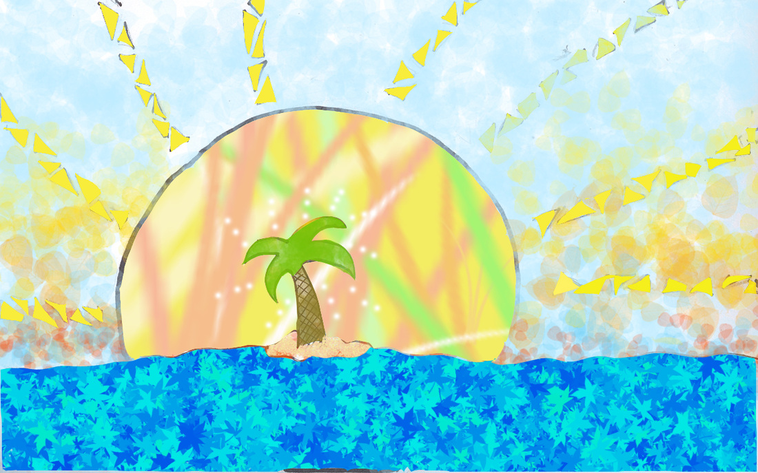
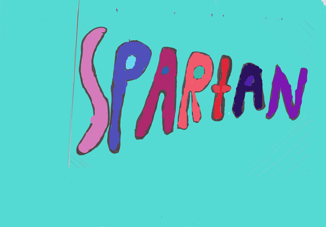
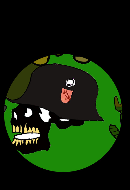
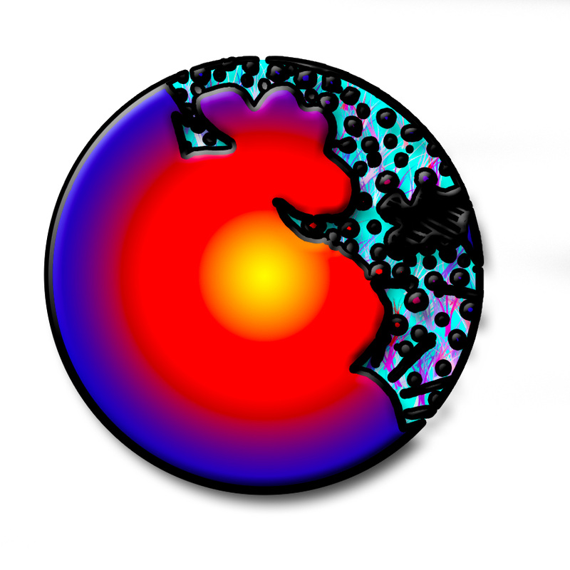
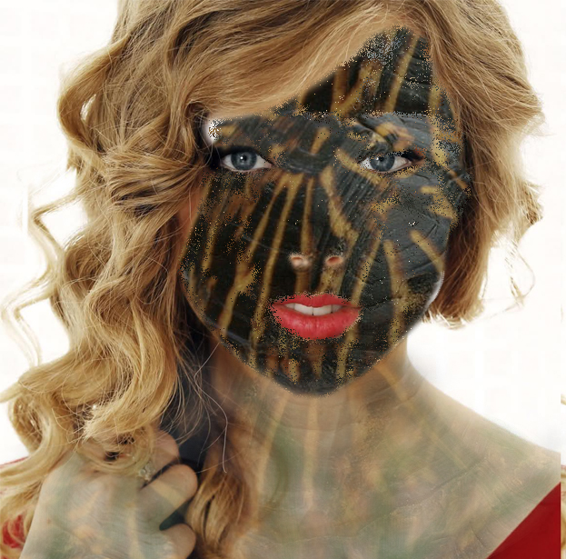
Choose an artist. Answer the questions on a page in your sketchbook. 1. What is the artist's full name? 2. What do you like about the artist's work? Be specific. 3. Where does the artist work? 4. What medium do you think the artist specializes in to create his/her concept art? 5. What work is the artist known for contributing to? Read the article provided. 1. Choose one artist. Read his/her response to each question. 2. Record the following on a page in your sketchbook titled "Take It from the Professionals": a) The tool he/she likes most b) Why he/she likes it c) How he/she best uses the tool d) How he/she learned to use the tool 3. Find a simple illustrator tutorial on the internet that will teach you to use the tool (You may need to do this from home). 4. Record the URL in your sketchbook and save a link to the tutorial on your Weebly page. In today's article, we ask five talented vector artists: "What is your favourite tool or effect?". We'll gain some inspiration insight into how they use these tools and see examples of where these tricks and tips have been used. Artists and their Favourite Tools & Effects Beto Garza Q: What is your favourite Adobe Illustrator Tool/Effect? The first time I used illustrator I always used the Pen Tool(P) to draw everything, but then after a while I became really interested in a more geometric style. So I fell in love with the basic Shape Tools. The ones that I use the most: the Rectangle (M), Ellipse (L), Rounded Rectangle and the Polygon. These and the Pathfinder panel are always my friends in most of my works. This is because with them I can draw whatever I want by simply adjusting some anchor points with the Direct Selection Tool (A) or scale some segments with the Scale Tool (S) for example. Q: Could you share with us your best tip on how to utilise this tool/effect? When I draw the first thing I do is a few quick sketches to get a good composition and see which figures I will use in my final illustration. When I’m finished sketching I go directly to Illustrator and start drawing by seeing my final sketch. I use a black stroke and no fill and I start drawing figures (in this case I made a quick icon of "La Calavera" of the Mexican lottery, by using almost only rounded squares). Some of them get duplicated to add some details like shadows and highlights. Then when I finish drawing I start to use Pathfinder options and bringing all the figures to life. Some of them I duplicate with the paste to back (Cmd + B) and paste in front (Cmd + F) commands, depending on the figure I will use Pathfinder on. When I’m done with that I select all my work and Click "D" to see if everything’s ok or if I need to send something to front or back or align and at last I add some color and details to the final illustration. Helen Huang Q: What is your favourite Adobe Illustrator Tool/Effect? One of my favorite Illustrator tools is the Color Panel, which is essentially a color mixing and editing tool. I learned it on my own by experimenting with different color mode in the Color Panel. Now I set my Color Panel to HSB as default. HSB is a great setting especially for selecting colors to use as highlight and shading. Q: Could you share with us your best tip on how to utilise this tool/effect? HSB stands for Hue, Saturation and Brightness. For highlight, decrease the saturation and increase the brightness. For a darker shade, increase the saturation and decrease the brightness. This way you get a very organic and natural looking shading color. Asher Benson Q What is your favourite Adobe Illustrator Tool/Effect? My favorite Adobe Illustrator tool/effect would have to be Gaussian Blur. I learned about it during a class in college, but really didn't think much of it, mostly because I wasn't properly taught how to use it. I remember my first projects with Gaussian Blur being a bit of a mess, and so I really avoided it for quite a few months. I always appreciated how clean my lines were while using the Pen Tool (P), but in some parts I really wanted a bit more softness. I tried layers and layers of transparencies and thinker strokes, but it didn't have the appeal I was looking for. Q: Could you share with us your best tip on how to utilise this tool/effect? As we're taught from grade school, the words: "if at first you don't succeed, try, try again" came back into play. I had learned how easy it was to apply from a professor, but was not instructed on it's finer points, therefore trial and error was a big part of my learning process. I learned that my comfort zone was between 2.1 and 3.8 pixels and that changing the opacity ever so slightly, could give me a more natural lit effect. I use it a lot with hair or jewellery though I used to use it for blush, and other assorted make-ups. After a few years, you come to find that it's not as useful in those areas and have gravitated towards the radial gradient color to transparency effect/tool for better control. I will however revisit Gaussian Blur for diffused lighting within a piece or the occasional snow piece coupled with feathered layers. It's a good effect, but I treat it more like the decorative sprinkles on a cake. You can use as much as you want, but if your basic ingredients aren't there then it just isn't the same. Justin Currie Q: What is your favourite Adobe Illustrator Tool/Effect? I've got a polishing trick I almost never skip: its the radial gradient used as a light bloom trick, I picked this up from Penny-Arcade artwork and since discovering it, I borderline use too much. I find it gives a nice soft edge to objects and adds a ton of atmosphere to any piece. Q: Could you share with us your best tip on how to utilise this tool/effect? Here's basically how it works. Step 1: Open a piece with a white background. Step 2: Make a circle with the Ellipse Tool (L). Step 3: Give the circle a radial gradient fill. Step 4: Change one Gradient Slider from 100% Opacity to 0% Opacity. Step 5: Now that you have a nice glow element, go crazy with it! Throw them around until you get your desired look, put it in places that light would be showing through Step 6: Enjoy! Surprisingly my tool of choice, is the shape tool. It is a fundamental element as it forms and structures most of my art works. The ability to alter the shapes diminishes its limitations into an endless wave of possibilities to create intricate patterns and stylistic appearance. Q: Could you share with us your best tip on how to utilise this tool/effect? By using the Selection Tool (V), you can change the shape by clicking on each anchor point and directing it in a path of your choice. Using the same selection tool, you can cut into a shape. For example, by creating a half circle you select the bottom end anchor using your white selection tool, then using back space to remove the bottom half of the anchor. Alternatively you can choose how much of a shape can be removed by adding anchor points to the shape. This can be done by selecting the Pen Tools (add anchor) function and clicking on the areas you do not want cut off. Check out your headers below. If yours is not on display you did not save and upload a jpeg image file OR you did not name your file correctly and it is lost forever in the depths of my computer image files (teaching art for 6 years makes for a whole lot of files). Please, fix that. And then, your grades will improve and we can upload our files to our own website. Congratulations, #4! Your work has earned the student choice award. 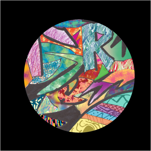 These are your top picks (a four-way tie!) on the clone assignment. Assignment: Leave a comment (with a nickname) that tells me which you like best AND one specific reason why it is a top student pick. Example: Pearl's is my favorite. It is a large image that isn't pix-elated, and I like the way the clone makes her look like she's wearing a mask. |
AuthorWrite something about yourself. No need to be fancy, just an overview. CategoriesArchives
May 2015
|


 RSS Feed
